Accessibility is essential to ensure that all users, including those with disabilities, can effectively interact with your emails. By optimizing the accessibility of your messages, you expand your audience, improve user experience, and comply with legal standards. Our platform includes various features to help you create accessible emails. Additionally, by adopting best practices in design and content, you ensure inclusive and effective communication.
Accessibility features in email templates
We have implemented several improvements to enhance email accessibility and continue to expand our efforts in this area.
Language support
- The <html> tag includes a lang attribute, allowing screen readers to detect the correct language.
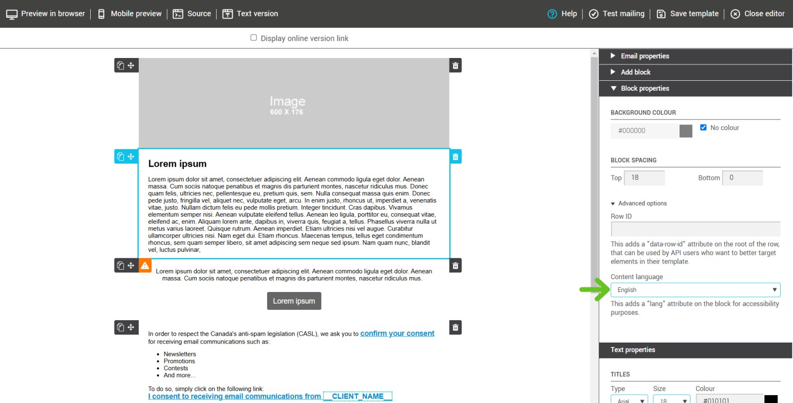
- You can change the language of specific sections of your email through the advanced block properties, improving accessibility for multilingual emails.
- A <title> element is included in the <head> section to help email clients and assistive technologies recognize the email subject.
- The dir attribute is applied to direct child elements of the <body> and is set to "ltr" (left-to-right) by default. While text direction cannot be modified or adjusted automatically for right-to-left (RTL) languages at the moment, this ensures that screen readers and assistive technologies interpret text direction correctly. Since left-to-right (LTR) is the most common text direction, setting it as the default helps maintain readability and prevents alignment issues for most users.
- A <meta content-type> tag is included to define character encoding and prevent display issues.
Structured and readable content
- Bullet lists are automatically wrapped in <ul> and <li> tags, ensuring proper interpretation by screen readers.
- Tables used for layout include role="presentation", preventing confusion with data tables.
Image support and alternative text
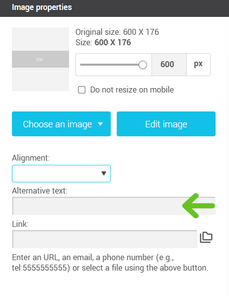
- Users can add alt text to images directly within the editor, allowing visually impaired users to understand their content.
Plain text version for better accessibility
- A plain text version of the email can be automatically generated, improving accessibility for some users.
How to add a text-only version to a template
Contrast and Readability
- A minimum contrast level is applied to key footer links (e.g., unsubscribe links) to ensure readability.
- Emails are fully responsive for optimal reading on all screen sizes.
Heading levels available in the editor
In the template editor, you can apply headings from h1 to h4 by selecting a paragraph style from the text editor toolbar. These styles help visually structure your content and improve readability, especially for screen reader users.
For a logical and accessible hierarchy, use a single h1 per email (typically for the main title), then use h2, h3, or h4 to organize sub-sections.
.png)
Video Block Accessibility
Video blocks have also been designed with accessibility in mind. When a URL is added to a video block, alternative text is automatically generated for the preview image, based on the video title. This text allows screen readers to announce the video content more effectively, enhancing the experience for users of assistive technologies.
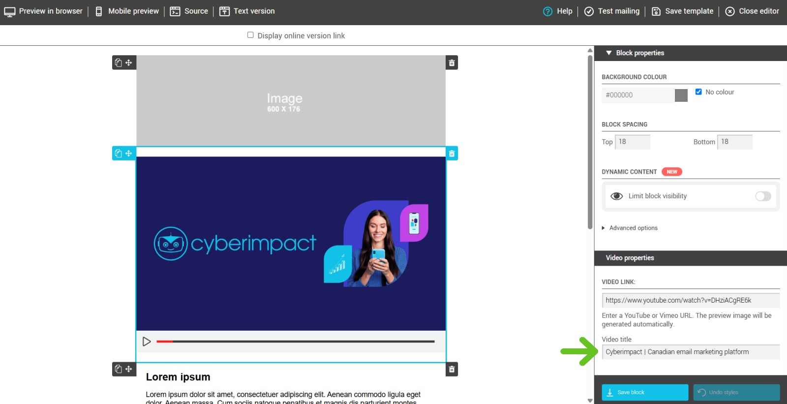
This improvement is built in by default and helps make your emails more accessible, no additional action required on your part.
Best practices for accessible emails
In addition to the measures we have implemented to enhance email accessibility, there are several best practices you can apply on your own. By making a few simple adjustments, you can improve readability and accessibility for a broader audience, including those using screen readers or with specific needs. Here are some tips to optimize your emails and ensure a better experience for all recipients:
Text and typography
- Use a font size of at least 14px, preferably 16px for body text (Litmus).
- Apply a line height 1.5 to 2 times the font size to improve readability.
- Prefer left-aligned text, especially for long paragraphs (Litmus).
- Use sans-serif fonts for better readability.
Formatting and structure
- Use bold text and spacing to structure content, but avoid excessive capitalization, italics, or bold, as they can reduce readability.
- Add clear and descriptive section headings, and follow a logical hierarchy (e.g., Heading 1, Heading 2, Heading 3) to improve readability and navigation.
- Use simple and easy-to-understand language, and avoid overly technical jargon (depending on your audience).
- Keep sentences and paragraphs short.
- Provide alt text for all images, ensuring that it accurately describes the image content.
- Avoid placing excessive text inside images.
Images and animations
- Avoid GIFs with flashing rates between 2 Hz and 55 Hz to prevent photosensitive epilepsy seizures (Litmus).
- Provide alternatives to GIFs, such as static images or text descriptions.
Buttons and links
- Use buttons and links with explicit text (e.g., "Read More" instead of "Click Here").
- Ensure links have sufficient contrast to remain readable.
Colors and contrast
- Use high-contrast color combinations (e.g., black text on a white background) to ensure readability.
- Avoid color combinations that may be problematic for colorblind users (red/green, blue/yellow, blue/violet) (Litmus).
- Check your contrast ratio with online tools like Accessible Web.
- Do not rely on color alone to convey meaning in elements.
Commitment to accessibility
We are committed to continuously improving email accessibility and appreciate your feedback. If you have any questions or suggestions, feel free to contact us.